Yarn America Art Project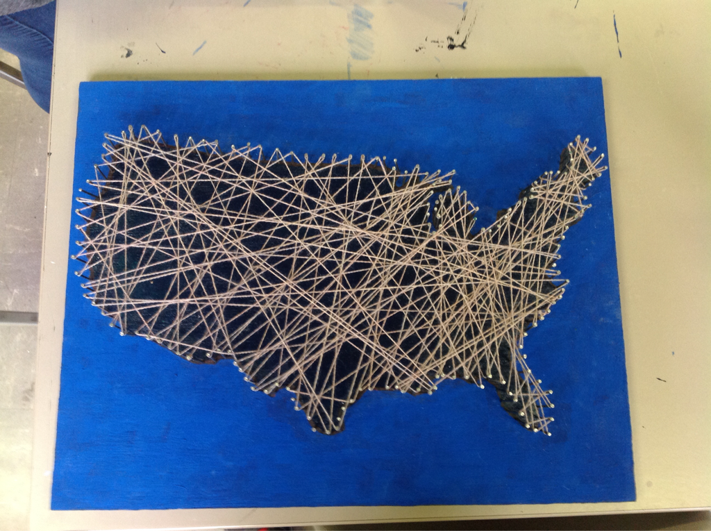 The idea came mostly from Marla as I worked with her on this project. She saw various images in the style of yarn with nails, and we decided to do something similar. We decided to do the United States as it was a shape that was simple yet complex enough to have some variety. First, we took an old wooden board and filled in all the holes with wood filler. We then painted the back and sides of the board black. After that, we traced an outline of the United States on the front and painted outside the trace blue while painting the inside green. After the paint dried, we hammered in nails along the outline of the United States. Once we did that, we cut out pieces of yarn from a large bundle and just started looping it around all of the nails. What we learned is that nails are difficult to work with at times. Sometimes they don't enter the wood at the right angle and come out crooked, or bend while they're being hammered in. Besides the issues with the nails, the entire piece went very well.
0 Comments
Midterm Blog PostI have gotten better at cutting paper out to what I need to be cut out. I have also improved in crayon melting and using masking tape more effectively to create sharp cut lines. New skills I learned this semester involve glass cutting, painting using tape, don't use hot glue on glass, and how to clean up excess paint or crayon using an exacto knife. I could have experimented more with glass or used scissors in my tape painting to create curved, sharp images and not just have the straight lines as the sharp part of the image.
Speed Cola Icon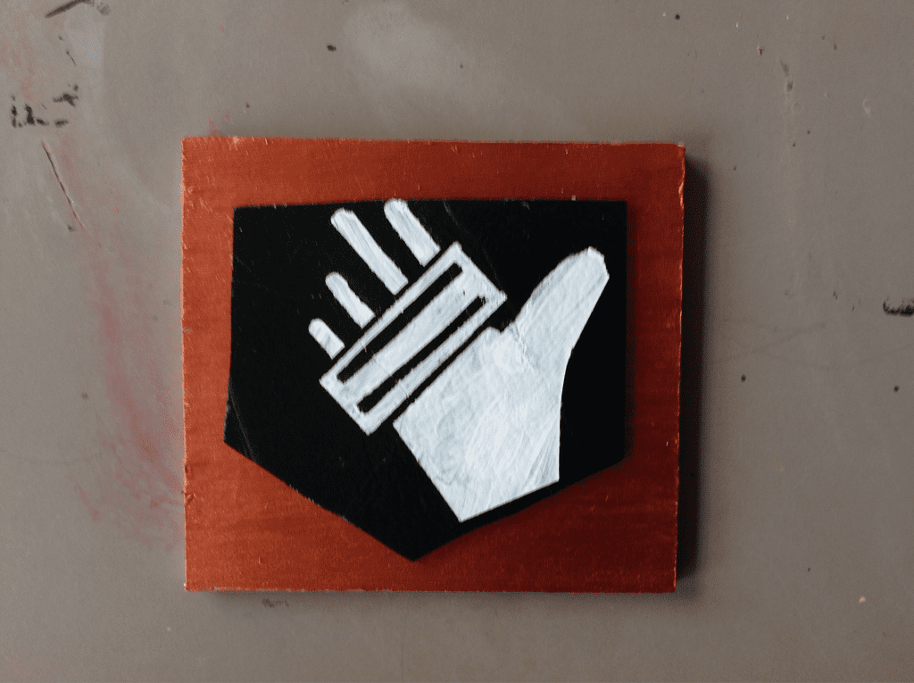 I had already made a juggernog icon, so I figured why stop there and went on to make another icon, speed cola. I wanted to do something different than paint on an icon panel, so I decided to use glass since there was an abundance of green glass. I cut out the outline in glass, and got a square wooden piece sanded down to put the glass piece on top of. I then painted the glass with white paint and used masking tape to create the straight lines seen in the image. I cut into the masking tape with scissors to make the rounded edges needed on the paint. I used a simple bronze acryllic paint on the wooden piece to add a background. After I painted everything, I used an exacto knife to clean up the leftover paint and masking tape still left on the glass. I learned that sometimes glass breakers, and because I liked the piece I had so much, I needed a background. The wooden background wasn't originally planned, but was useful to combining the two broken glass pieces to look like one. Additionally, paint wasn't the original idea for the image painted onto the glass, but the original idea of hot glue did not work and thus had to be changed to paint.
Red:Mission - Expansion to Re:MissionI started this board game expansion as I liked the idea of the first board game, Re:Mission, but I wanted players to be affected each round, not just on their turn. Thus I started the creation of Red:Mission, where depending on the spaces players are on at the end of the round they can be affected by the newly added red cards. I also found out that while item swap spaces were a cool idea, they weren't entirely fun. Thus I wanted to create a new card type to replace the item swap places, the consumable cards. I liked the idea of single-use but powerful cards. I finally settled on making consumables have little effect but being able to use multiple in one turn. I used poster board similar to my previous board, but I did not create a paint background as that would warp my board and make it difficult to play on. I then created the board outline on a separate piece of paper to finalize what I wanted before tracing it onto the poster board with pencil and then going over the pencil with sharpie. I used colored sharpie and paint-markers to create the symbols for gold, black, consumable, and mission card spaces. I then used colored pencils for all the background colors and red spaces. What I learned as I went is that people don't like choosing consumables over the black and gold cards. As such, I created multiple lines that automatically give people consumables as they progress through the board. Thus, players will be able to have consumables to use while still being able to pull gold and black cards. Another thing that I added were attribute cards, which give players unique abilities throughout the game and can be upgraded for more powerful effects. I added these last minute and I'm glad I did as they add a secondary objective to the game. 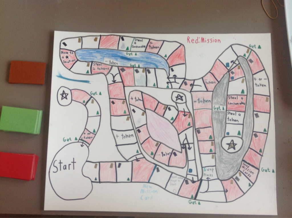 Re:Mission Board Game Blog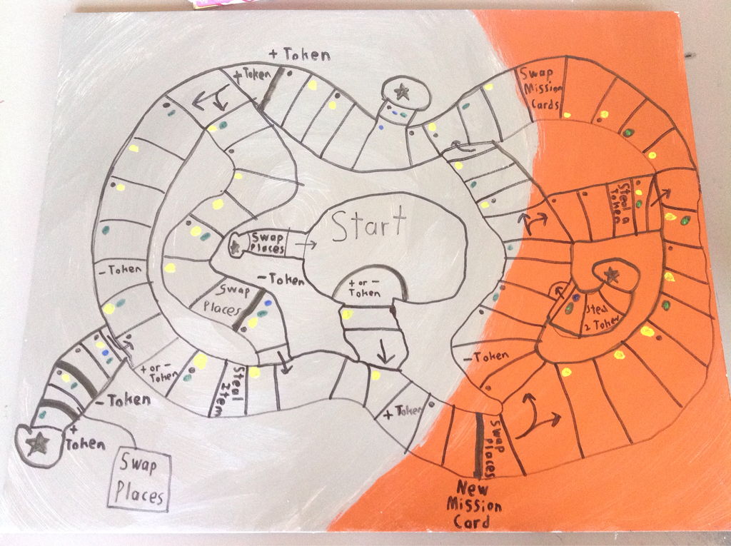 I first started out wanting to make a board game where anything could change at any moment of the game. I love games that keep you on your toes and as such wanted to make one to share that with my friends. I made a rough sketch of the board I wanted with a piece of paper, and then I made a background on a larger poster board. I then transferred the outline of the map on the poster board. I then proceeded to work on the different components of the game using construction paper for the cards, various beads I found and painted around the art classroom, and marbles I painted for the board game pieces. Something that changed along the way was that I planned to use markers to color in the dots for the spaces on the board. Yet they weren't always very clear cut what color they were, so I used paint for some of the dots to make it easier to tell which color each spaces had. I learned that paint can warp your game board if you're not careful with it. I also learned that people don't like to have a lot of empty spaces, so I adjusted the game board to include more action spaces. I also learned an efficient way to make close copies of similarly shaped cardboard cards rather than measuring using a ruler and drawing lines to cut along. Juggernog IconMy original inspiration for this project was that I wanted to create the symbol for juggernog simply because I wanted to start a collection of the perk icons that juggernog belongs to. I used paint to create the main image, and I used finer paint brushes for the finer points within the image. I started with the outline of the perk symbol, then I drew in the image itself. I originally wasn't going to color the white portion of the symbol (the background of the icon board I used was white) but I decided it would help to make the image pop out more and it turned out looking better. A change I learned along the way is I can use masking tape to create sharp, straight lines to separate the symbol from the background. This helped me to create a sharp background and a sharp symbol without the two overlapping each other. I also wasn't originally going to have a background, but I decided to use one to help the symbol itself pop out more. 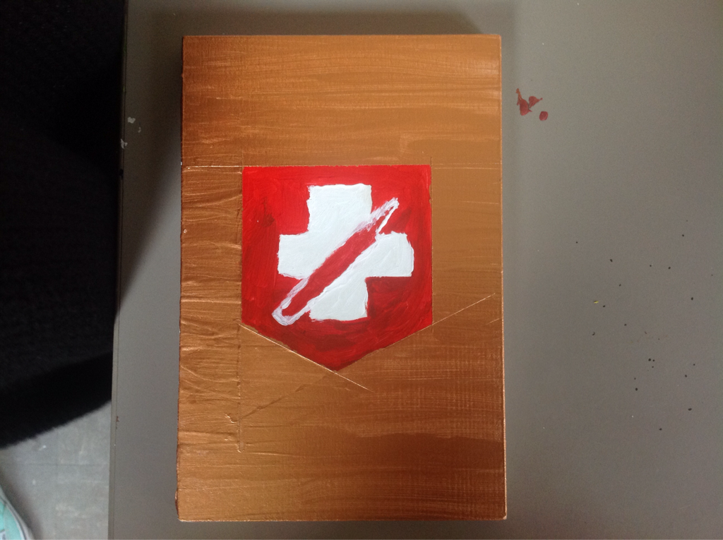 |
AuthorWrite something about yourself. No need to be fancy, just an overview. Archives
January 2017
Categories |


 RSS Feed
